Samcom
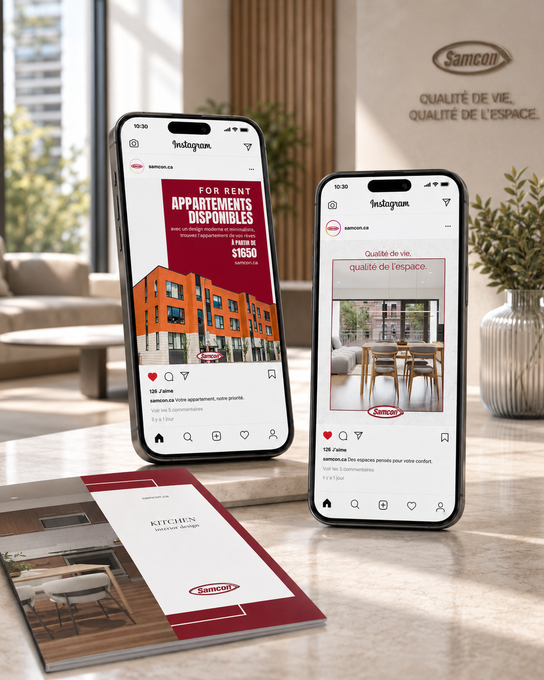
Samcom is a real estate developer based in Quebec. They needed one thing: social media posts. The branding already existed, I arrived to work inside it.
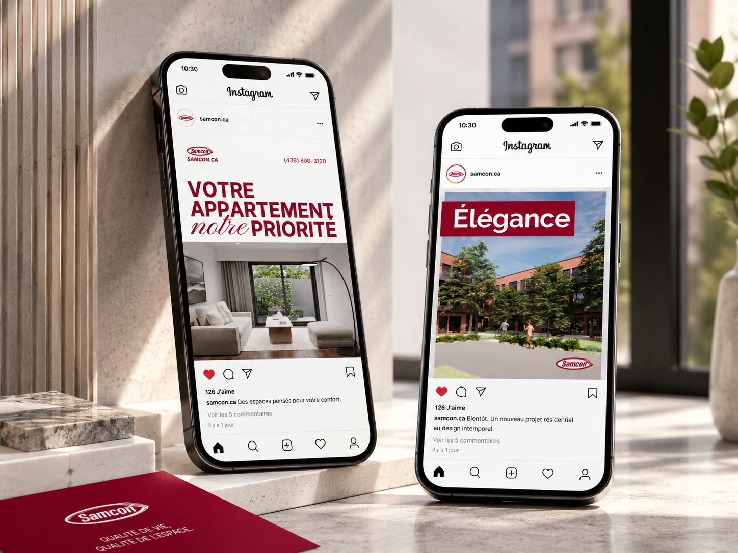
Design
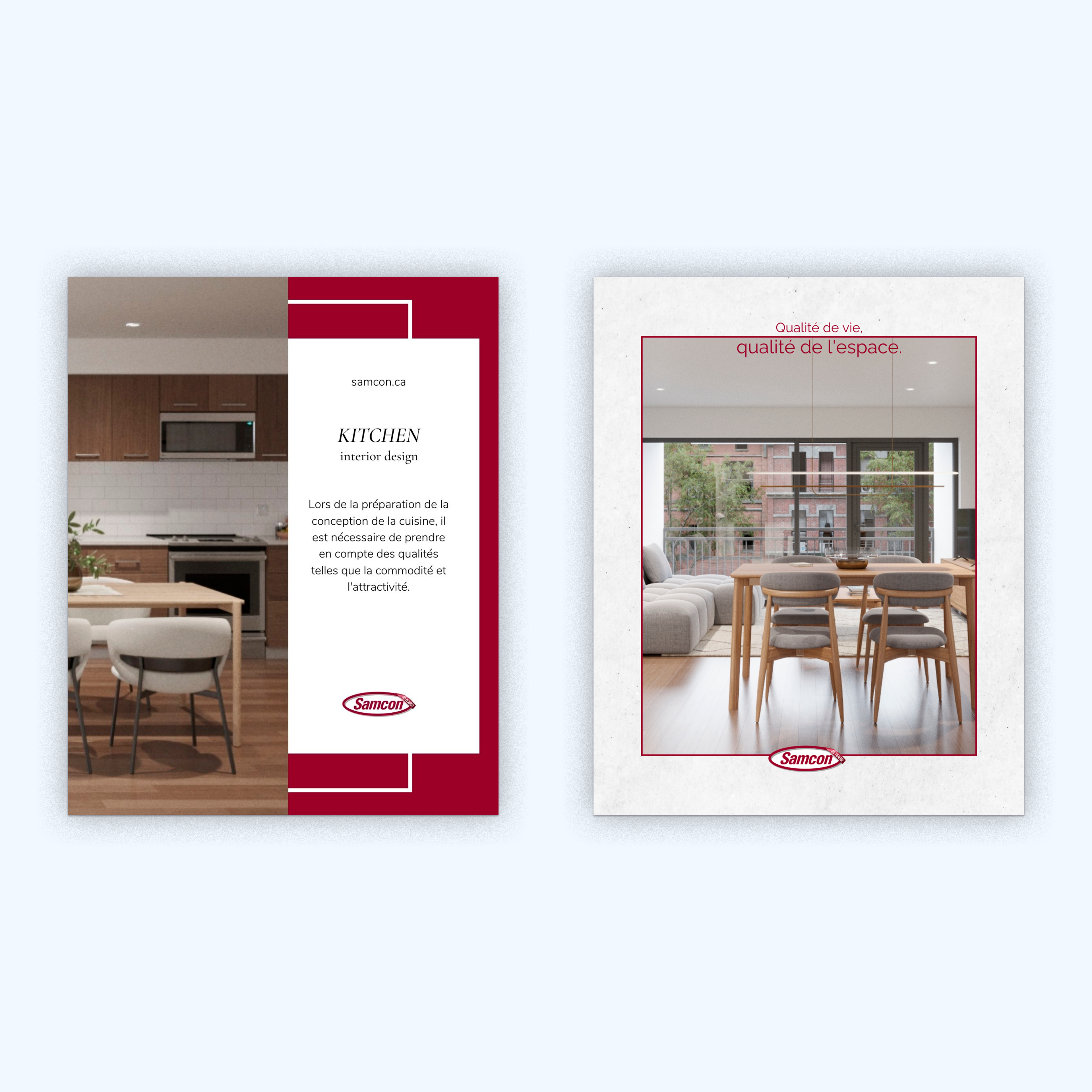
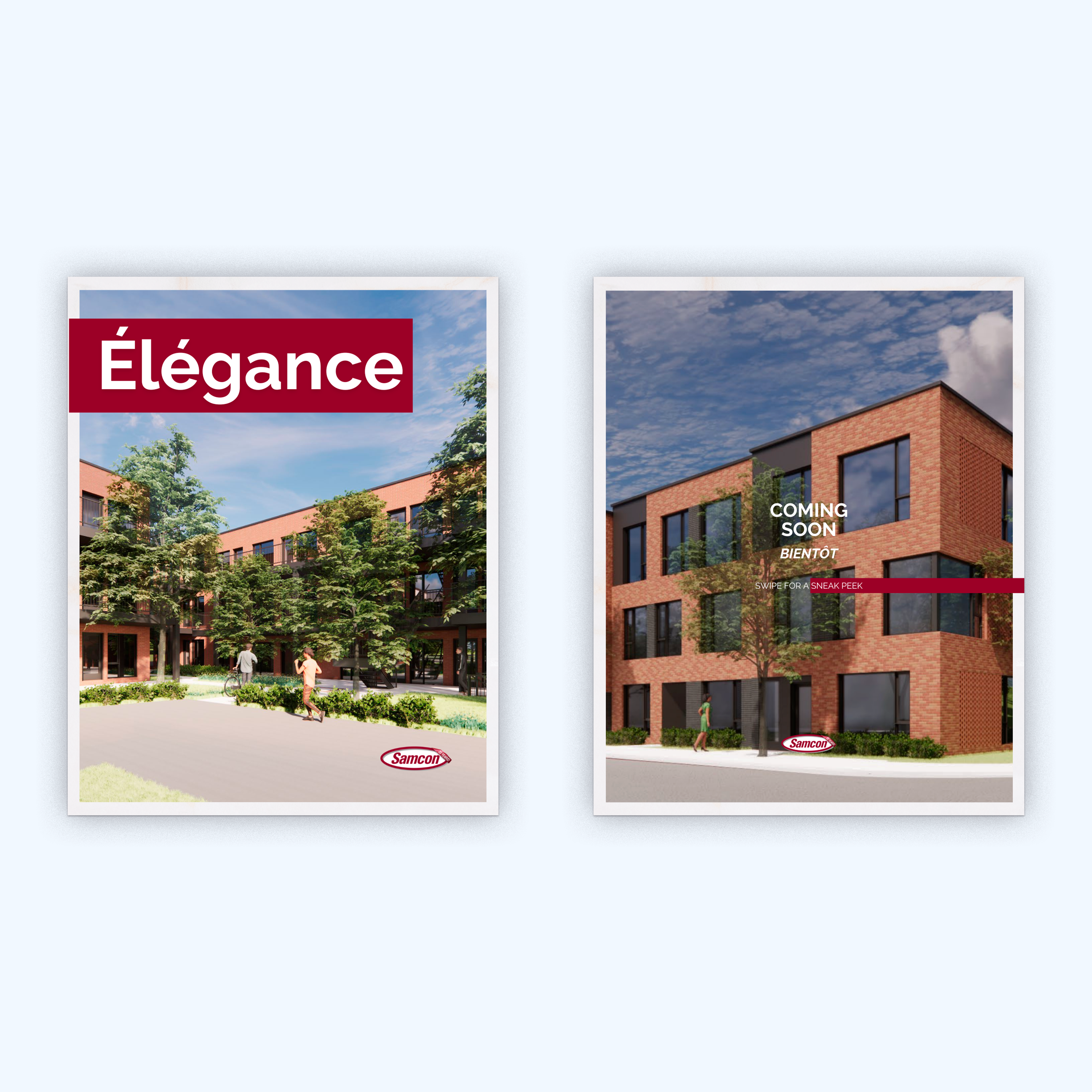
When the system is fixed, the problem is something else. Red, white, photo, copy in French or bilingual. The palette isn't the decision. The decision is hierarchy: which element leads, how much air the photo gets, whether the typographic contrast is actually doing something or just sitting there.
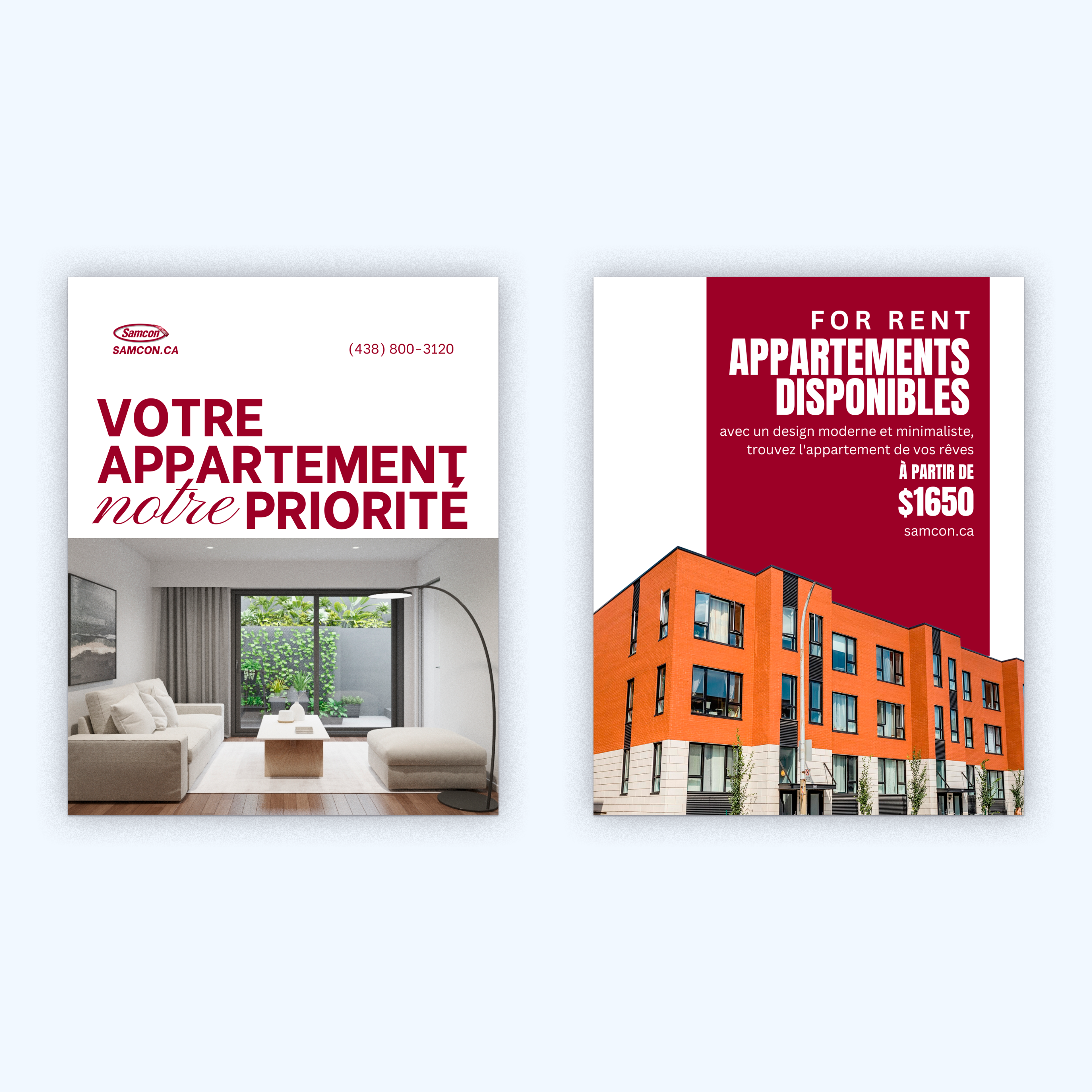
The "VOTRE APPARTEMENT / notre / PRIORITÉ" poster comes from that logic. Heavy caps interrupted by a script that says the same word differently. Not decoration. A pause that makes you read the headline twice.
The bilingual constraint added its own layer: French and English in the same layout had to feel like a single decision, not a translation stacked on top of the original. Quebec real estate works that way, and the posts had to handle it without the seam showing.
A year of work in a conservative market. The job wasn't to push the brand. It was to make every post worth stopping for.